DX Spatial Grid:↳ Token Inspector
A development-only inspector for React 18 and 19, published on npm. Click an element on your own page, calibrate its radius, padding, gap, margin and colours, and copy the result out as CSS, JSON or a prompt for whichever agent you use.
Back to Work// 01
Overview
The DX Spatial Grid & Token Inspector is a small open-source tool for inspecting a React UI while you build it and editing its spatial and colour tokens on screen. It grew out of the same design-systems problem I was solving in Mothership: AI tools and handoffs drift when tokens and layout rules are not visible, inspectable, and exportable in the environment where the UI actually runs.
// 02
Challenge
Design tokens and spatial layout rules often live in Figma variables or JSON files, but the truth is in the compiled UI. Without a harness that bridges those layers, calibration becomes guesswork and every agent or engineer session starts from zero. I needed a small, honest DX surface that made node structure and token values legible in the browser, then let me copy results back out as CSS, JSON, or a paste-ready agent prompt.
// 03
Try it
Harness + overlay tabs · no login required
npm install -D dx-grid-inspector
MIT · building in public
// 04
Outcome
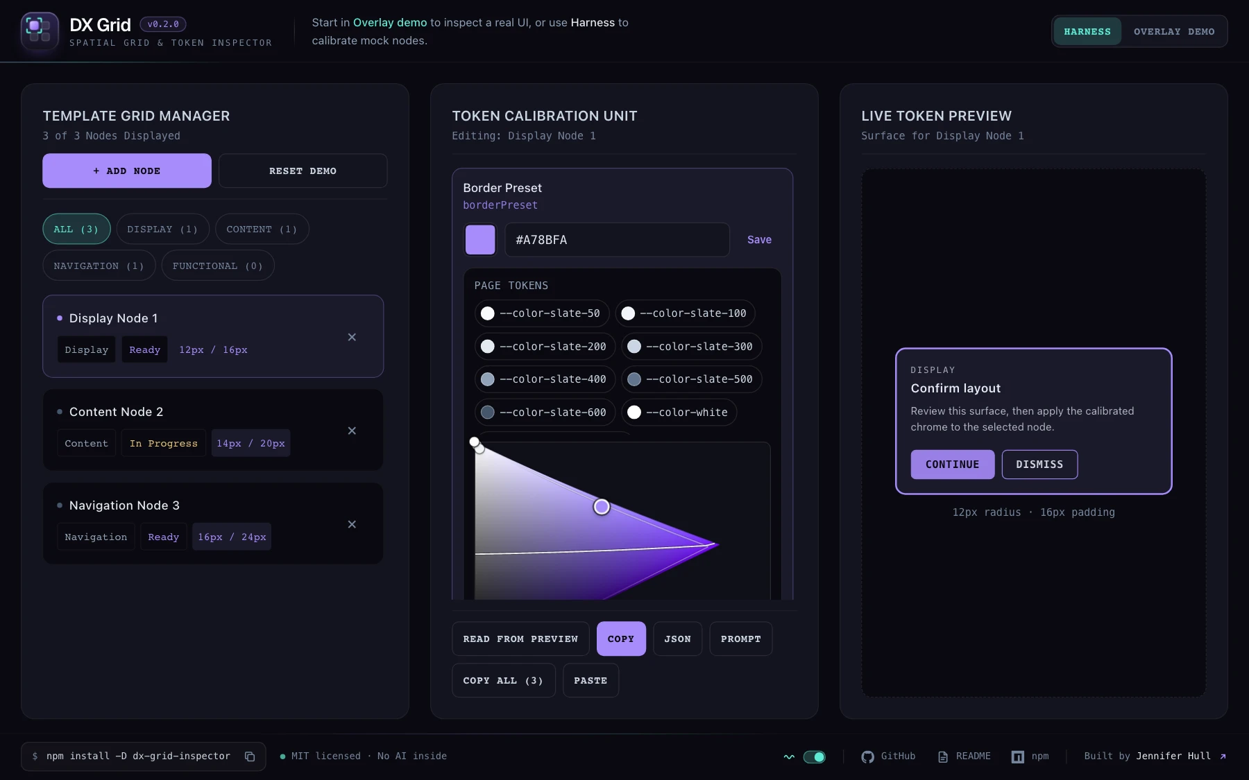
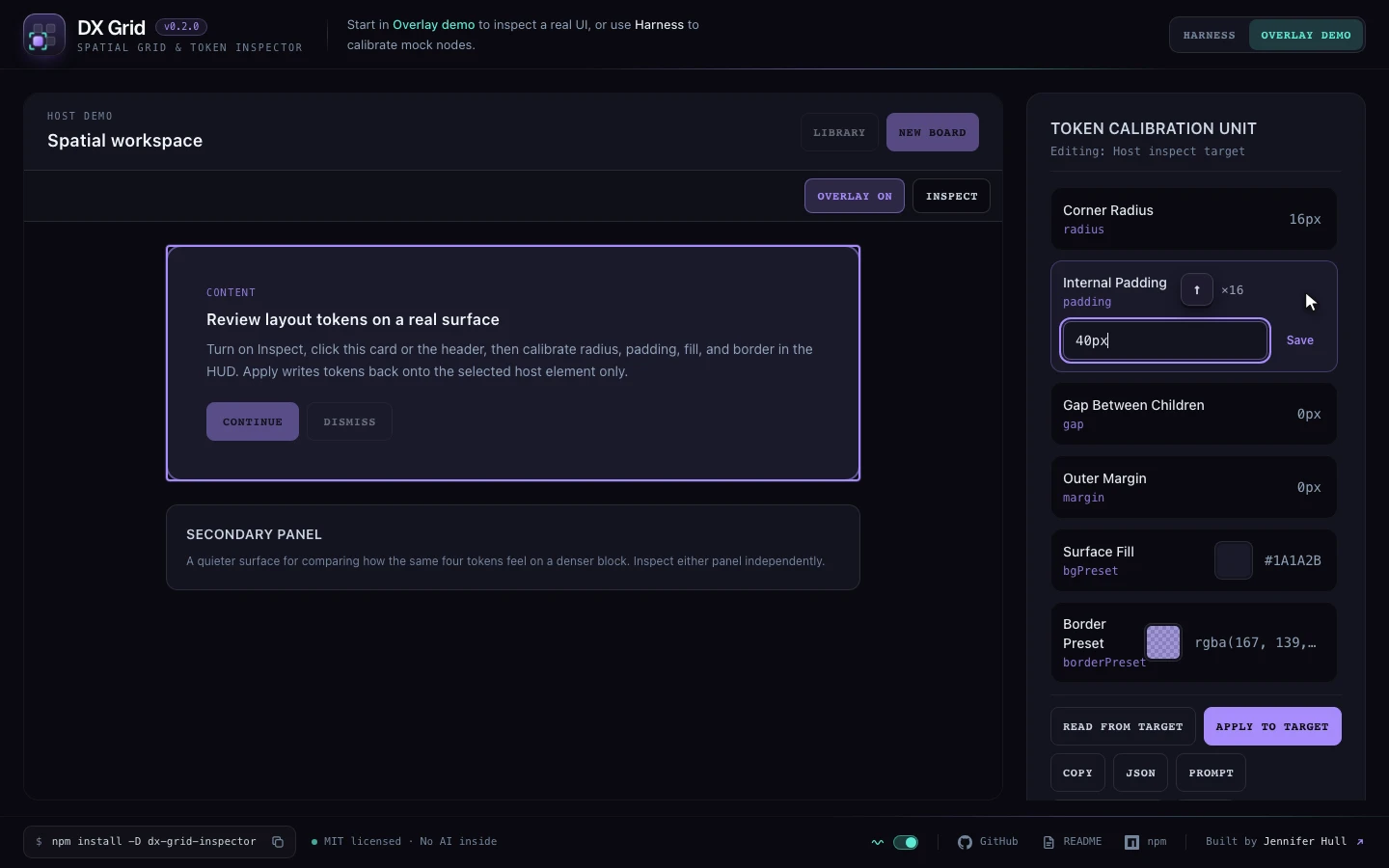
It ships two modes: a three-panel Harness (Template Grid Manager, Token Calibration Unit, Live Token Preview) for calibrating mock nodes, and an Overlay that wraps a real app so you click the element itself. It is MIT-licensed and published on npm as a development-only package, with React as its only peer dependency.
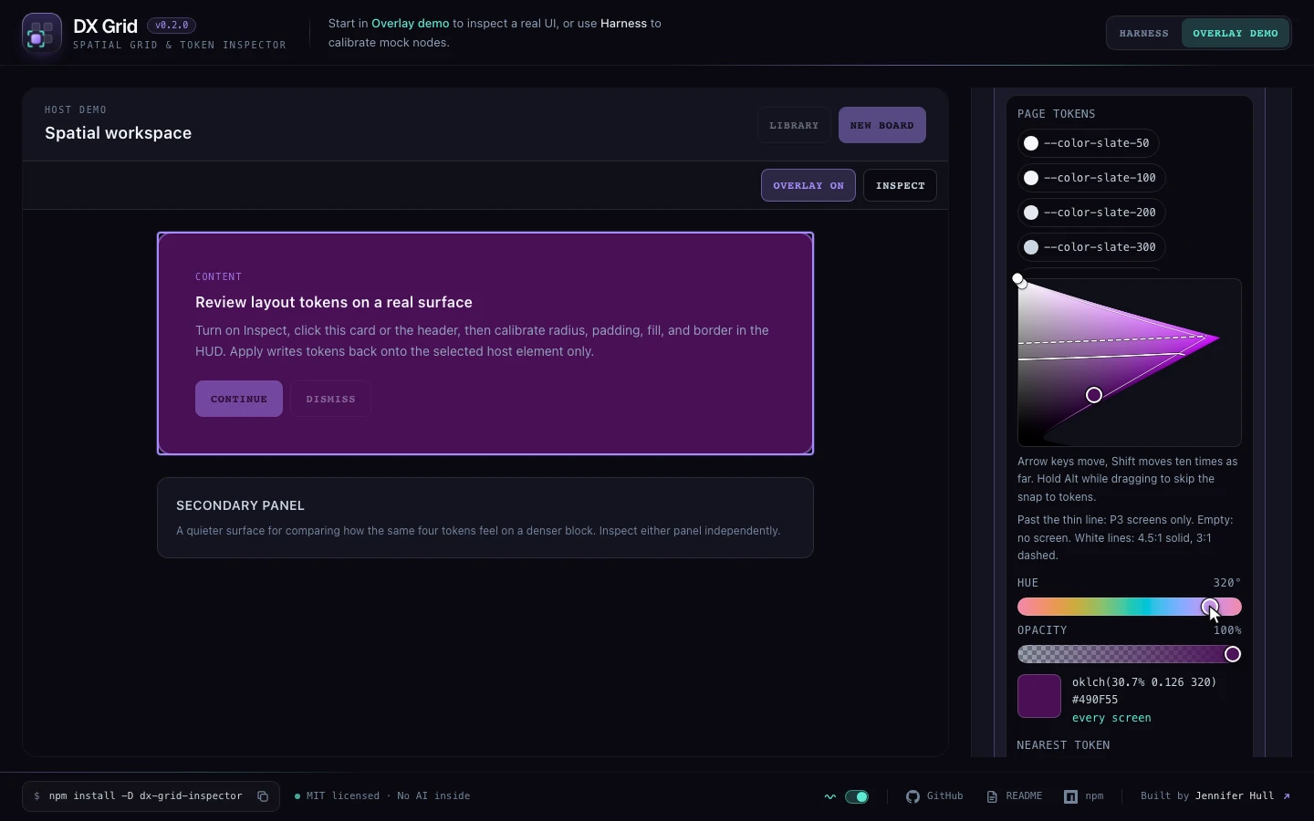
Version 0.2.0 came out of the first outside feedback. After 0.1 went out, someone in a developer community asked for three things: arrow-key nudging, a real colour picker, and a way to export everything at once. All three shipped, along with gap and margin. The colour picker is my own, with no dependencies. It works in OKLCH, lists the page's own colour tokens first and snaps onto them, shows which screens can display a colour, and gives the contrast ratio as you drag.
// 05
Reflection
It started as a portfolio-scale open-source slice, and it still shows how I think about DX tooling: small surface area, deterministic exports, and no fake in-app AI. The difference now is that feedback comes from outside, and 0.2.0 is the first release shaped by it. The repo is the source of truth; the live demo is the proof.